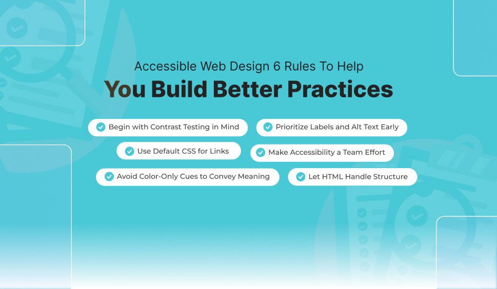
Accessible Web Design: 6 Rules To Help You Build Better Practices
Want to build a more accessible website? The simple answer is to read over the Web Accessibility Guidelines (WCAG) and follow the needs when crafting your designs. But knowing the rules does not mean you will be allowed to follow better practices. Accessibility is what is required to be built into your workflow because making basic mistakes is quite easy.
This blog will define the six simple rules that can lead web designers towards a more inclusive mindset.
Begin with Contrast Testing in Mind
Low contrast, being one of the most prevalent accessibility issues, is due to the designers emphasizing aesthetics primarily. If you do not have color vision deficiency (CVD), commonly known as color blindness, then you could easily miss low-contrast text. It’s better to start by testing color pairs before adding them to your designs.
Prioritize Labels and Alt Text Early
Alt text writing is quite easier for an image. It only requires a few seconds to tag the image unless your website has numerous images with no alt text because it’s a multi-day or even multi-week project.
Add alt text along with the images. Similarly, pay close attention to other text substitutes and form labels; remediation will take much more time than merely doing it accurately throughout your build.
Use Default CSS for Links (Unless Justified)
Internet users usually recognize hyperlinks through their bright color and underline. However, developers occasionally remove the underline to form a cleaner look, depending on color only to specify links. This approach can negatively impact accessibility, as color alone isn’t a trusted way to carry meaning for all users.
For navigation, hyperlinks are significantly crucial. Therefore, no changes should be made, which could make it difficult for users to identify them. Keep the defaults if there is no good reason to change them.
Make Accessibility a Team Effort
Web designers have a crucial role to play, but accessibility must be a steady priority for each of your team members. Back-end developers, customer service representatives, and content creators must have a basic knowledge of WCAG.
When everyone is focused on accessibility, it is quite easier to identify errors before they influence users, and when the WCAG principles are a part of your workflow, you will be facilitated more by the advantages of inclusive design.
Avoid Color-Only Cues to Convey Meaning
As discussed earlier in this blog post, few people can’t sense color, which is why you should not use colors only when delivering crucial details. When you are working with color, ask yourself promptly whether the color is different or if all of the content is clear and makes sense.
Here are a few instances of web design decisions that would fail WCAG’s needs for color use.
- A form submission fails due to the user not entering details in the required field. It’s the page that asks the user to fill out the field highlighted in red.
- A promotional email asks customers to click the green button to look for the weekly deal.
- A chart utilizes diverse colored lines to symbolize diverse data sets with no labels or different patterns.
- An online banking platform uses green to show a positive account balance and red for a negative balance.
This requirement could easily be forgotten about. By preparing yourself to think about the color’s functionality, you can make sure that users have numerous ways to get the required details.
Let HTML Handle Structure, CSS the Look
Most designers work visibly, resulting in semantic-related issues. It’s important to provide information regarding your website’s structure in a way that is programmatically determinable so that screen readers and other assertive technologies (AT) can understand the structure.
Luckily, HTML is broadly supported and exceptionally efficient. Avoid using HTML for style, which is important here. For instance:
- Do not use headline tags like H2, H3, etc., due to how those tags look over the page.
- Don’t use <p> tags for visual space.
- Don’t use <table> tags to attain a specific visual layout.
- Don’t use <ol> or <ul> for layout. HTML lists must be used for lists, not layout.
- Avoid using too many <div> or <span> elements as an alternative to accurate semantic HTML.
Final Comments
Including accessibility in web design is not just a technical necessity but a dedication to inclusivity and better user experience for all. Complying with these six simple yet vital rules, testing color contrast initially, maintaining hyperlink clarity, adding alt text from the beginning, avoiding color-only cues, using semantic HTML properly, and encouraging a team-wide accessibility mindset, you can build more usable, welcoming, and following to WCAG standards websites. Building accessibility into your workflow ensures that your designs work for everyone, making the web a more justifiable space for all users.
Why Choose WAC?
Choose WAC for your web accessibility requirements, given its all-inclusive ADA and WCAG compliance tools, along with real-time monitoring and an easy-to-integrate accessibility widget. WAC streamlines compliance to accessibility standards while helping you with identifying and resolving accessibility issues to make your website inclusive and user-friendly for all.
 Let's Discuss Your Tech Solutions