The Importance of Tooltips in Web Accessibility
Imagine trying to get through a difficult website without any clues or direction. Now imagine doing so with a disability that restricts how you engage with that website. That’s where tooltips help. Those small, often ignored pop-ups that appear when pointing at an icon or field. Tooltips, when applied accessibly, can be an influential supporter in enhancing the online experience for all users, specifically those with disabilities.
What Are Tooltips and Why Do They Matter?
Tooltips offer additional context or guidance when users roll over or emphasize certain elements, such as buttons, icons, or form fields. These short descriptions assist in clarifying what the user is envisioned to do or what a symbol signifies. They play a refined yet crucial role in user understanding and ease of navigation.
For users depending on assistive technologies such as screen readers or keyboard navigation, tooltips can assist in bridging the information gap by providing essential descriptions and decreasing vagueness. The aria-describedby HTML attribute helps link tooltips to elements so screen readers can comprehend and read them out loud.
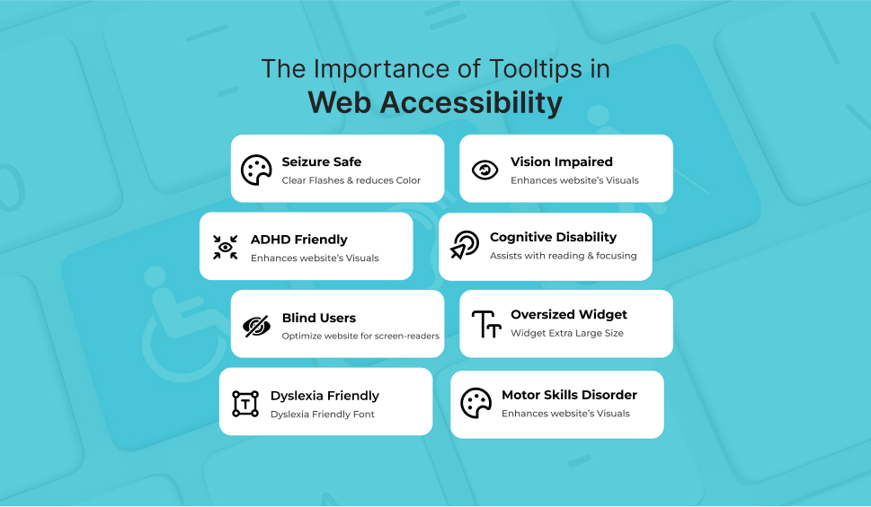
Enhancing User Experience through Accessibility
Clear, accessible tooltips considerably improve the user experience by making web elements more comprehensible. For instance, a tooltip clarifying a cryptic icon helps all users, but particularly those with cognitive impairments, make better sense of what they’re engaging with.
Poorly planned tooltips, instead, can irritate users. If a tooltip is vague, hard to read, or placed clumsily, users might abandon their task completely. This is specifically true for those with vision impairments or motor skill challenges, depending on constant, readable, and accessible tooltip designs.
The Challenges in Implementing Accessible Tooltips
One of the key challenges is corresponding design aesthetics with functional accessibility. Many designers incline toward minimalism and smooth interfaces, which could occasionally compromise readability or usability. For instance, using fancy fonts or low-contrast colors may look good visually, but make tooltips incomprehensible to numerous users.
Moreover, tooltips that only appear when hovering could distinguish between people who use touch devices and those who use keyboards. Accessibility best practices, therefore, recommend that tooltips be both focusable and hoverable, keeping visible until they have been eliminated or no longer needed.
Best Practices for Accessible Tooltips
To create tooltips that really serve everyone, consider the following ideologies:
- Clear, concise content: Use plain language that connects the determination without jargon.
- Readable typography: Select readable fonts and the right sizes, specifically for users with visual impairments.
- Adequate color contrast: To ensure text transparency, follow WCAG guidelines (minimum 4.5:1 contrast ratio).
- Logical placement: Tooltips must not hinder other interface elements or content.
- Keyboard accessibility: Tooltips must be available through keyboard navigation, not just mouse hovers.
- Persistent display rules: Enable tooltips to stay transparent as long as required and terminate them easily.
Following ARIA (Accessible Rich Internet Applications) guidelines and using attributes such as aria-label, aria-describedby, and role=”tooltip” can improve screen reader compatibility and assist in creating a steady experience throughout assistive technologies.
The Business Case for Accessibility
Accessible tooltips are not just morally significant, but they’re also good for business. Making your site more comprehensive opens it up to a larger audience, including millions of users with disabilities, resulting in increased engagement, improved customer satisfaction, and a stronger brand reputation.
In numerous jurisdictions, compliance with web accessibility standards such as WCAG and laws such as the ADA is obligatory. Inaccessible tooltips may not just cost you users, they could lead to legal penalties.
Tools and Resources to Help
Numerous tools and frameworks could help ensure your tooltips are accessible. Use contrast checkers such as WebAIM and design tools like Figma or Adobe XD with accessibility plugins. Training programs, like those presented by The A11y Collective, can enhance your team in inclusive design and development.
Conclusion:
Tooltips might be small, but their influence on accessibility is enormous. All users’ experiences could be significantly improved by taking a few minutes to set up and employ accessible tooltips. By doing so, you demonstrate your dedication to integration and thoughtful design alongside meeting regulatory requirements.
Accessibility must not come as an afterthought, and neither should your tooltips. Make them visible, make them beneficial, and above all, make them available.
Why Choose WAC for Accessible Tooltips and More?
When it comes to executing accessible tooltips and accomplishing larger digital accessibility, WAC (Web Accessibility Checker) stands out as a consistent, comprehensive solution. WAC offers practical insights and tools, including as an accessibility widget and real-time monitor, besides auditing your website for WCAG and ADA compliance. This ensures that your tooltips, navigation, and content are accessible to all users, including those with impairments. With WAC, you can build digital experiences that are comprehensive, accommodating, and user-friendly without negotiating on design or performance.
Improve Web Accessibility with Our Checker
Let's Connect
 Let's Discuss Your Tech Solutions