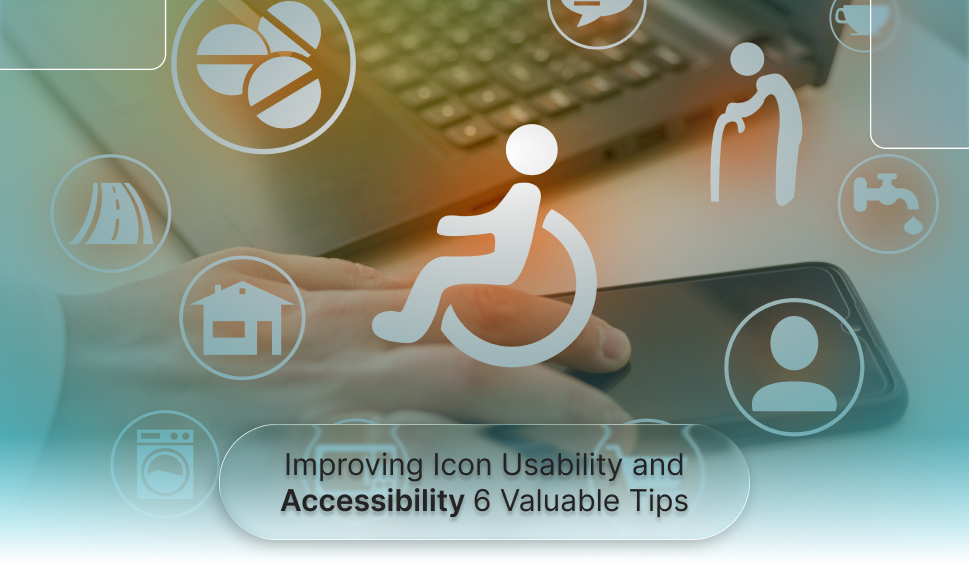
Improving Icon Usability and Accessibility: 6 Valuable Tips
Icons might seem like simple visual elements, but they are the universal language that bridges users and interfaces throughout the world. With the diversity of the audience out there, it has become increasingly crucial to make sure that these icons/symbols are visually appealing, usable, and universally accessible. Here, we’ve outlined six actionable tips to elevate your icon designs from good to exceptional, focusing on ease of use and accessibility. Whether you’re a seasoned designer, a developer with an eye for detail, or someone passionate about digital inclusion, these insights will empower you to create icons that resonate with a broad range of users.
1. Ensure Strong Colour Contrast
Colour contrast is a key element of accessible icon design, helping users with low vision or colour blindness distinguish icons easily. According to WCAG 2.1 AA, icons and text should have a contrast ratio of at least 4.5:1 for optimal readability.
Tools to test colour contrast:
- WAC (Web Accessibility Checker) – scans pages for WCAG compliance, detecting colour contrast and navigation issues.
- WebAIM Contrast Checker – verifies colour contrast accuracy.
- Stark Plugin – checks and adjusts contrast within design tools.
- Accessible Colour Palette Builder – creates compliant colour combinations.
Avoid using colour alone to convey meaning, and pair it with shapes or outlines for clearer, more inclusive design.
2. Make Icons Keyboard, Mouse, and Touch Accessible
Accessibility isn’t just visual, it’s also useful. Icons that act as buttons or links must be functional using a keyboard, mouse, and touchscreen.
Best practices include:
- Ensuring all interactive icons are focusable using the “Tab” key.
- Enabling activation with “Enter” or “Spacebar.”
- Adding ARIA labels to describe their purpose for assistive technologies.
- Providing visible focus indicators so users know where they are on the page.
This makes sure users who depend on assistive tools, such as screen readers or alternative input devices, can completely navigate your site.
3. Make Icons Clearly Visible and Easy to Tap
Icons should always be visible without needing users to hover or click to expose them. Visibility comprises both size and placement, two factors that immediately impact accessibility.According to WCAG 2.2, touch targets (like buttons or icons) should be at least 24×24 pixels, though 44×44 pixels is suggested for optimal usability.
Larger icons:
- They are easier to tap on touchscreens.
- Reduce frustration for users with motor impairments.
- Enhance the overall mobile experience.
When designing, balance size with layout aesthetics to preserve both beauty and usability.
-
Pair Icons with Text Labels
Even universally accepted icons can confuse users when shown without context. For instance, the “hamburger” menu icon (three stacked lines) can be clear to some but puzzling to others, particularly new users or those unacquainted with digital interfaces.Adding short, descriptive text next to icons removes ambiguity and ensures clarity. For example, a simple label like “Menu,” “Search,” or “Settings” helps users instantly understand what an icon represents.
Benefits of adding text labels:
- Enhances comprehension for all users, specifically those with cognitive or visual challenges.
- Expands the clickable area, making icons effortless to tap on touchscreens.
- Supports screen readers when combined with proper code and alt text.
Text labels make navigation more intuitive and accessible, reducing the learning curve for all users.
5. Maintain Consistency Across Platforms
The key is to stay consistent when reducing confusion. Every icon should represent a similar function across all pages and devices. For instance, a magnifying glass should always mean “search,” not “zoom.”
Consistency helps by:
- Reducing cognitive effort, as users don’t need to relearn meanings.
- Creating predictability, as users know what to expect.
- Improving cross-platform experiences, as the same icons look and act the same on desktop and mobile.
Avoid reusing similar icons for numerous meanings and ensure that icon styles (line, filled, or outlined) remain consistent throughout your interface.
6. Write Effective Alt Text
Alt text (alternative text) gives screen readers a clear description of what an icon represents, making it important for users who can’t see the icon.Your alt text should identify the function, not just the appearance. For instance, an envelope icon should have alt text like “Email us” rather than “Envelope.”
Quick guidelines for writing alt text:
- Be clear and concise (e.g., “Home,” “Download report,” “Add to cart”).
- Skip phrases like “image of” or “icon of.” Screen readers already announce them as images.
- Leave alt text empty (alt=””) for purely decorative icons.
- Make sure interactive icons have meaningful alt text describing their action.
When using Scalable Vector Graphics (SVGs) or icon fonts, include proper Accessible Rich Internet Applications (ARIA) labels or titles to ensure screen readers inform them accurately.
Wrapping Up
Accessible icon design is more than just aesthetics; it’s about communication, inclusion, and usability. When you follow these six tips, combining text with icons, using strong contrast, adding meaningful alt text, ensuring visibility, maintaining consistency, and supporting all input methods, you build digital experiences that everyone can use.
Accessibility doesn’t stifle creativity; it enhances it. By designing icons and interfaces that are inclusive and intuitive, you’re not only making your website more accessible but also more engaging for all users. When accessibility is prioritized, it leads to design choices that are clearer, more functional, and ultimately more effective, benefiting everyone, regardless of ability.
How WAC Supports Icon Accessibility?
Web Accessibility Checker (WAC) helps you find and fix issues that impact the usability of your icons. It scans your website for accessibility impediments like poor color contrast, missing alt text, or restricted keyboard navigation, ensuring your icons meet WCAG and ADA standards.By providing clear, actionable insights, WAC brings ease for designers and developers to create icons that are intelligible, functional, and accessible to everyone.
Improve User Experience with Web Accessibility Insights
Let's Connect
 Let's Discuss Your Tech Solutions